Pages

Ads 468x60px

Labels

Labels

Labels

Download

Labels

Monday, April 26, 2010

The Artistic Design Small Home

The development of the property world at present is very rapid, this is marked by numerous property development units, for example: apartment or condominium that is super exclusive luxury development of houses or small, simple.

Along with the development of the property world, the needs of the community will house these days is very high. If insufficient budget to buy a house that middle-end, or a simple little house was not an obstacle to realizing the desire for home. Almost all developers offer a small house lots or products, due to high demand of home / place of residence, then only a short time were able to sell hundreds of housing units. The problem is, many developers take advantage of that momentum by building a small house with the facilities and environment, as rudimentary as we know, that is Very Simple House (RSS).

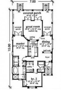
Describe the tiny house with a condition like that it's time to change. Consumer is king, people also are appropriately given the best. Houses must be beautiful, healthy and environmentally friendly. That's the key word to build whatever size house, including building a small house or choosing. Tiny houses that are marketed typically have a maximum of 100 square meters wide with a size variation of 6 X 15 m, 7 x 15m, or 8 X 12 m, and standard forms of building houses.

Layout Rumah

Layout

Front View

Front View


Beautiful is not necessarily expensive. Creativity is a wise and intelligent design actually able to realize efficient small house building materials and get around all the limitations, both funds and land. Beautiful concept can be translated in the form of blueprints of the house is straightforward and easy maintenance. Encouraging the development of limited land a tiny terraced house.

Plan open space and minimal wall, both walls, wall, or door, making the room feel spacious. Merging functions tailored to the needs of the inhabitants of the space.

Carport, porch and front gardens functioned as a living room, children playroom, parking of vehicles, even meeting the RT / RW. Optimized for space in the family room and dining room. The function of the family room, study room, and children's bedrooms can also be placed at the top to the floor under the roof (attic). Garden and patio used as an open dining room, family room, and children's learning space, with a different time.

The bathroom is a room that requires special handling and maintenance, start sanitation utilities, major appliances, and material selection. Materials ceramic or terrazzo floors of the coarse texture is meant to avoid slipping and to extend the impression of small-sized space. Broad limitations can be made dry bathroom with a shower of glass-walled closed box or plastic curtains. Although the placement of septic tanks placed in the front garden, but the distance is still relatively close to the water pump so that for the long term, can contaminate ground water. For that purpose, to consider re-placement of septic tanks collectively transferred in the parks environment.

Structuring practical all together with kitchen dining room or on the patio (open dining area).

General concept of the home provides a bedroom and bathroom attendants in the back, below, or above the near room service, washing, and drying. Now design a service room, washing, and drying, bedroom and bathroom and kitchen helpers stationed at the front of a dirty house, overlooking the family room adjacent to the carport.

View artistic home does not require expensive ingredients. The walls of the house of adobe and brick walls with the completion of exposure or a combination of stucco or kamprotan with careful workmanship and neatly, or they can be put on the wall of steel plates. Ceramic KW-2, KW-3, or a unique terrazzo also not less interesting beautify the house floor. Ketidakpresisian materials can still disiasati by nat-nat wide.

The contents of the home furnishings should be versatile, in accordance with the priority needs of the family, and the proportion between the size of the furniture and the living space. Tables, sofas, couches, under the sink, to the space underneath the stairs is optimized for storage of goods and dispersed as needed function space so no need to create a warehouse.

Settlement of the floor, walls and furniture with the color and / or similar materials on the outer space to give the impression of vast space in imaginary space. Gradations of color that blend right in every sense of space also influences the living space as well as providing psychological effects (psychiatric treatment) to the occupants of the house. Unity of themes and colors will help the orderly and airy home impressed, between floors (dark), walls and furniture (medium), and the roof of the ceiling (light).

HOUSE petite should also be healthy. Home is where the physical and mental health therapy occupants, both in times of sound, in healing, or are sick. The house where the body of relaxation to restore freshness.

Electricity crisis and rising electricity rates should be anticipated with the priority use of electrical devices and energy-efficient home design. Optimization of sunlight as a source of natural lighting throughout the house early in the afternoon and moonlight and stars at night.

Optimization of sunlight and air circulation can be created by opening doors and windows with a width and length to touch the floor, at least 2.75 meters tall ceilings, and skylights in the dining room, bathroom, or bedroom above would give the expansion of an imaginary space.

Each room had sought fresh air and sunlight are good for the health of occupants, and their money home and occupants. Houses can even minimize the use of Air Conditioning (AC), fan, and lights, especially in the daytime.

Installation of mirrors on one wall, like on the terrace, living room and bathroom, will add a vast imaginary space. Decorating the walls with paintings, family photos, certificates, plaques, or ethnicity as a focal point objects to add living room atmosphere as well as providing psychological therapy to the residents.

Pages narrow they can be used as a park water recharge (dry garden) with a simple structure from bottom to top, pumice stone, roofed, coral, coarse sand, and soil / pebbles / gravel, with a thickness varied according to soil conditions.

Planting trees in front gardens (the most possible) as compared to the rear garden which supplies oxygen and provides shade and coolness to the hosts. In the morning, residents are still advised to open windows and doors to ensure the availability of sunlight and fresh air to warm the space and replace the stale air inside the house.

Tiny house would be more comfortable if the problem of clean water availability and quality obtained from the PAM, a hand pump, or pump machine with a good note, especially if there is difficulty to clean water in the dry season. Then, how the waste management system also needs to be studied carefully, whether administered alone (recycling) or provided temporary shelter.

Besides the things already mentioned above, here are some tips that can be used to maximize your small house design:

Interior Small House

Interior Rumah Mungil


USE MIRROR

Mirror creates the impression of vast space. Use a mirror in the dining room table or living room. Large mirror in the right place to produce strong spatial effects. Before a mirror placed on the wall, we can first try placing it in several places to determine their effect on space.

USE OF DESIGN-BUILT-IN DESIGN

Design of built-ins to create the impression of space which is simple and makes a wider space. Moreover, it can reduce the cost of purchasing furniture. For example in bedrooms, cabinets can be made "attached" to the wall or in the gypsum. We just need to make shelves in it and make the door just to minimize the cost of making furniture. The inside of the cabinet can be coated wallpaper so much sweeter.

USE THE SMALL SIZE FURNITURE

For example for the dinner table. Use a small dining table and placed stick to the wall with four chairs. Chairs used a better impression of puff so that a wider space. Use a coffee table and credenza also small ones.

CHOOSE FURNITURE memorable LIGHTER

Do not choose the furniture that "heavy" and thick. Find furniture that is thin and shaped frame, not fields. Examples for the credenza tv, select furniture legs, do a full up to the floor.

SELECT COLOR SPACE THAT YOUNG

Dark colors do not space for a large wall areas. Choose colors so bright and impressive young broad.

Maximize STORING PLACE

Use the best furniture for storage. For example making the drawers under the bed, bedside table that can store goods, credenza that can load the magazines and all other furniture. With a lot of storage would reduce the stuff that was left lying and if charcoal multiply no need to create another storage place.

FINAL IMPRESSIONS CREATE

Do not leave blank wall is too big. Blank wall can be filled with paintings or decorations. Do not also made too full. But just enough so that the building does not seem empty and cold.

Now, you too can enjoy the beautiful little house, healthy and environmentally friendly.

Other articles you should read: To build and renovate houses in the style of a designer

----------------------------

Additional: Please visit our web / blog (free layout) if you need and want to see / use layout designs a house for free. Tp to now not been able to download the image design / layout, because it has not met a suitable provider .. Maybe this weekend can be downloaded. Thank you for atensinya ..
Tips Using Images In Web Design


Often the beginner web designers to use the excess in the design drawings, as a result of such web will be felt slowly when loaded by the browser.
Although web graphics are good but in designing a web page designer should pay attention to the contents (content) from the web, but not until you beat the functionality of the web is actually just because the graphical display.

Use graphics must be able to cope with the needs and functions of the site, eg the composition of colors and shapes, and the impression that protrudes from the web, whether for commercial purposes? Personal site? company? government? or place an online gallery? and much more.

Use graphics or pictures are not quite right on a website may cause you'll lose visitors that you actually need.


Use of Images On the Web
Here is a list of web parts that usually wear a picture but also many web designers who use the text for that section.

1. Navigation buttons
The navigation key is absolutely needed in a web, with clear navigation buttons settings will help visitors find the information diinginkanya, berberapa things to consider in making the navigation buttons are writing or text must be clearly visible and readable.

2. Logo
Whether a company logo, organization or personal logos often use image, logo image serves as the identity of the company, a good logo can enhance brand name of a company or organization.

3. Site Map
Use the site map image can indeed facilitate visitors in finding information but the use of images in the site map should be on the web you choose correctly whether or not to be too lamabt.

4. Bullet
bullet widely used to emphasize certain points in the document

5. Banner
Banner posted on the website with the aim to improve the mix of shapes, colors and important information (Hot Items) are often used in websites, with graphics that will attract visitors interested to click on the banner. - Also Known as a title graphic. Main function is to let your visitors know Which web

6. Boundary
Boundary line between menus, web parts, separating the footer, header and content of both horizontal and vertical web fit for use because the line usually have a smaller file size.

7. Background Images
This section is used to provide characteristic, and the composition of the contents and background on the web to be made, provided that the image file used is not too large, the background image fit for use.

8. Headings
The reason images are used for headings is most often due to some type of text is not contained in the client computer, because it used an image file instead.

9. Photos
Photo of activities or activities that highlight specific sections of the website is necessary, with a clear picture is expected to direct visitors can understand the property whom, for what the website was created, and the category whether web site. The use of photos is often used to clarify the items and products on e-commerce website.


Some things to consider in the selection and use of images or graphics to appear harmonious to the web by you
are:
1. Color graphics must match all, be it between menus, company logos or orgonasisasi, header, footer and gackground used.

2. Colors in the text must be readable navigation key with clear, note the size of the text to be entered on the navigation buttons, if too small? if it's readable?, usually the color of text in a customized navigation buttons (not necessarily the same) with a color logo or headline website

3. Do not use too much color combinations, for excessive color combinations will be impressed tacky and slow the process of downloading the browser, simply use two to four color combinations in the website, except for certain mascot or icon.

4. Note the size of your website against any additional images or graphics, the most common sizes are 40 to 70 K, with an average 28.8 modem connection

5. Separate images that have a different color, this occurs at the graphics contained color or two color degradation lebih.lebih perbagian either try to cut out different color, it can accelerate the process of downloading images on the browser.

6. Choose the correct file type, when you use gamabr file gif jpeg and when to use, the selection of an appropriate file type gamabr will accelerate the process of downloading the browser.

Remember not to make use of graphical website's primary function is not fulfilled, if your site is too large size due to the many image files, change the background, the dividing line, bullet points, headings and with HTML

Photoshop Basic

Photoshop tutorial this time on the copy and paste the selection, maybe this is a basic lesson, but this is necessary for beginners who are new to photoshop in order to better understand what is and layer selection
This tutorial is a continuation of so-principled tutorials presented here as the development of the selection process and the recognition layer

In accordance with the author's experience in this case I personally ^ _ ^ first time in Photoshop wrestle it difficult to make a circle and wake up the other box. These distinguishing between playing photoshop and coreldraw, in coreldraw we can easily create a wake up using only vector rectangle tool in photoshop but we must be clever - clever use of selection (selection).

Selection (selection) is a magic that must be mastered in any way whatsoever and photoshop. Expertise of a master photoshop starting from this phase.
Thus the picture of photoshop hopefully useful to readers of GI (science Graphics) ^ _ ^

Now it is time introduction way of making up (the box) by using selection tool

1. Open Photoshop, using photoshop cs4 sy here but this is not a problem for those of you who still use photosohp 7, CS, CS2 and CS3 because this technique can be applied in any photoshop

2. Create a new worksheet
> New (CTRL + N)" onmouseover="this.style.backgroundColor='#ebeff9'" onmouseout="this.style.backgroundColor='#fff'">How: File>> New (CTRL + N)
Simply press the OK by default your photoshop

3. Now Create a New Layer (CTRL + SHIFT + N)
nah this is photoshop and coreldraw distinguishing, in corel we do not have to bother making a new layer, but in photoshop if you need to create a new layer to the image you who have not mixed with other images.
Example:
make the selection with
photoshop tutorials
Rectangular marquee tool (M) and put the pointer to the canvas (your worksheet)
Hold Right click and forming a selection is marked with dots - black and white spots
photoshop tutorials

Click the Fill Tool
photoshop tutorials
Then click your selection for these
taraa eventually be colored
photoshop tutorials
press CTRL + D to eliminate the selection / white black spots

Well here we can see that we have two layers:
photoshop tutorials
which means that we make up box will have a high freedom of movement (FREE)

4. ok now according to the title of this tutorial we will discuss about the create a copy (how to copy) from the selection that we make up a symmetrical
make another selection with
photoshop tutorials
Rectangular marquee tool (M)
guess - something like this
photoshop tutorials
Then Press CRTL + C (this is the command to COPY), followed by the CTRL + V (paste the results of the command to copy)
Viola
photoshop tutorials
we get up that dimetris

With the above techniques you can create a variety of ways, for example flags INDONESIA:
photoshop tutorials
Thus the basic tutorial from me, see you at the next basic tutorial, I hope this tips useful for all readers and visitors IG

Sunday, April 25, 2010

free download photofonts in Adobe InDesign

Photofont ID — use photofonts in Adobe InDesign

Easy to use

* After installation, you will see a new Photofont tool at the bottom of your InDesign toolbar. Use that tool to create a new photofont frame, choose a photofont and the font size, type some text, choose the text alignment and click on OK.
* The photofont frames remain editable: double-click on any existing photofont frame to change its contents, choose a new photofont or change the size.
* The photofont frames will automatically rewrap the text when resized.
* Use InDesign’s View / Display Performance setting to control the display quality of the photofonts on your screen.
* When printed or exported to PDF, InDesign will automatically use the highest possible quality (resolution) of the photofont.

Photofont ID
Use photofonts in Adobe InDesign!
for Mac and Windows

Photofont? is an exciting new font technology that allows you to create and use multi-color type with transparency.

Photofonts are files with the extension .phf. They are bitmap fonts that can be of any size, use up to 16 million colors and alpha transparency.

Photofont ID is our plugin for Adobe InDesign CS3 and CS4 for Mac and Windows that allows you to use photofonts inside of InDesign to set headlines in color, textures and photos.

The photofont file format specification is publicly available. It is based on open standards such as XML and PNG. You can create and edit photofonts using our professional bitmap font editor BitFonter for Mac OS X and Windows.

Visit our photofont.com website to learn more about the Photofont technology, view photofonts in use and download some free photofonts

NEW!

* add color to your fonts
* use textures in your headlines
* overlay with transparent text

Mac system requirements

Mac OS X (Intel and PowerPC), Adobe InDesign CS3 or CS4

Windows system requirements

Windows XP/Vista, Adobe InDesign CS3 or CS4.

Click here for download

Web Design

Designing a website is a combination of art and technology. Design Color Pencils are really concerned factors beauty, beauty, architecture information, the accuracy of mark-up structure, ease of use or user friendly, efficiency, practicality, ergonomics and interface standard from the W3C organization website world.

In Color Pencil Design, we strive to make convenience for visitors to your website so the visitors feel at home for long diwebsite you.

Web design services from Design Color Pencils include:

* Website Design Company Profile
* Web Management
* Content Management System / Blog
* Design and set-up e-commerce or online store

Web Design Company Profile

Website company profile webpage consists of several static pages of company information, product information, vision and mission of the company contact person. This company profile website usually consists of 50-30 pages of our webpage is uniquely designed with a hand-coding.


Web Management

Maintaining a website requires resources both time and money are not little, albeit for a simple website. Management web service offered as a solution for those of you who do not have time or do not want to burden the company's resources to manage the site professionally.


Web management includes monitoring and updating the website, adding website content, email maintenance and make regular back-up site.

Management web service is very convenient for those of you who do not update the website every day but any time we want to reach consumers with news of up-to-date information on your company, the latest products and your company press release. If you want every day to update the contents of the site would be more appropriate to use a CMS (Content Management System) or Blog

Content Management System / Blog

For those of you who need to update the website daily, the correct solution is to use Content Management System or blog so it will be more cost-effective. Color Pencils Design has expertise in designing the Drupal-based websites and based WordPress, Joomla and Multiply design.

Design and setup of e-commerce or Online Store

Color Pencils Design also provides website set-up e-commerce site or online store, starting from selecting the application to designing e-commerce sites or online stores you to interesting, easy to use, giving the impression trusted to encourage consumers to transact with you.

Skills Required to Become a Graphic Designer

Those who become successful graphic designers usually have a unique blend of talents. They are intelligent people who are knowledgeable in a wide range of areas, comfortable creating designs that blend images with words and media to produce visually simulating concepts. Graphic designers are able to work alone and interact with clients and other professionals. They are familiar with the latest technology and able to incorporate it into their work for fresh ideas, while simultaneously marketing themselves, their work, and their talents.

If you think creatively and logically.

Most people go into professions that use one side of their brain or the other. Accountants, for example, use the left side of their brains for logical, analytical thinking. Artists and actors tend to use the right side of their brains, stimulating creativity and intuition. Graphic designers tend to use both side of their brains to concoct inventive yet rational creations. They acquire and use knowledge to create fresh designs and to work within the boundaries of software applications. Graphic designers see how a project may look visually through each stage of the design process, but they are able to think through the progression in a logical manner as well.They can make critical decisions that influence a design and they can understand how those decisions may affect the later stages of the design process.

If you like learning new technology.

Graphic design may still involve a few sketches on a sheet of paper, but the development of technology over the last several decades has revolutionized the graphic design industry. Design layouts are created on computers so it is imperative for graphic designers to be able to use software in their expertise. They also must be able to adapt to new software as technology advances. This may require learning on the job. Graphic designers are able to use their creativity and logic to figure out how software works and how it can be used effectively in their current projects. In addition to the technological expertise, graphic designers have a wide knowledge across types of multimedia. They work with animation, photography, and Internet applications. As technology in these areas develops, a graphic designer must adapt to those mediums as well.

If you have business sense.

Business is also a critical aspect to graphic design. Graphic designers must take on the roles of sales and management teams now and then. As marketers, they must be able to sell their idea for a design to clients or other professionals. As managers, they must work within the confines of a budget as well as recognize the legal ramifications of borrowing from other ideas. Often, graphic designs run their own businesses. Graphic designers such as these are involved in every stage of the process, from the packaging of an idea, to the presentation of it, to selling it to the client.

If you enjoy working with other people.

Graphic designers are communicators. Whether they are communicating a message visually, verbally, or in written form, they must be able to converse and listen well. Pigheadedness will not get you very far in the graphic design field. Graphic designers must be willing to redesign. If the customer is unsatisfied with the work, then it doesn’t really matter how good of a design was made. Flexibility is required for dealing with clients.

Many of these skills can be acquired through career training at a technical school. Communication, organization, and technological skills can be developed through courses toward a certificate. Graphic design combines the best aspects of art and logic into a lucrative career.

Architecture With Nature unites

Architecture With Nature unites

SEE cultural richness and beauty of Indonesia, making us have to look sharp to use it. This is done in applying the concept of Waka, where nature and culture becomes an important element in the architecture design.

An integrated natural beauty in an area resort or villa is very important. Utilization of space on every inch of accuracy needed to draw a line and mature thinking. Of the many demands of villas and resort design is how to direct the view from off site to view, whether it is a mountain valley or anything that could produce a good scene. Process the site plan at the location of an architectural language translation by architects to provide comfort.

Waka Waka Group, which consists of Nusa, Waka Maya, Waka Namya, in Ume Waka, Waka Waka Gangga and Shorea, a villa and resort facilities were created with in-depth observation and appreciation of the meaning of architecture. Hasilnyapun strong character, beauty and comfort parameters that are created are a reflection of the appreciation and profound observations about the culture of Bali. Not that uses the concept of local culture is the concept of 'ancient,' but this is a tribute to the architecture of the Archipelago.

Balinese architecture we know it has influenced the basic concepts of spatial values, such as the concept of hierarchy of space, the orientation of cosmology, cosmology of balance, proportion and human scale, open-air court, and the concept of honesty of construction materials.

Intregasi values into image building of nature is always there at every Waka complex, so the formation of the building can affect the environment and get the visually interesting view. Not only that, the elements that are attached to clear buildings using natural elements such as wood, sandstone, stone etc.

From here we will see a difference in villas and resorts owned by Villa Waka and other existing resorts in general. Zoning patterns and existing facilities have almost the same, where as a support to give maximum comfort. On location contoured building units are not always at the same elevation. This view is intended to avoid obstructions to a minimum.

In essence, the design deliberately closer to the elements of nature and culture of Bali, and this can be seen from the planning of buildings, arrangement of space / zone, the circulation pattern. This could answer the challenges faced from a different dimension, namely the condition of the site, architecture and marketing value. Once again nature of collaboration and integration will result in satisfaction, user comfort with a mature concept.

Saturday, April 24, 2010

Download Adobe InDesign free

Adobe InDesign is a program designed for graphic designers to create publications.

Although the program was thought to make paper pages, it also has a support for virtual documents (for example, PDF format).

The tools that Adobe InDesign has are completely intuitive, and are Developer with an intelligent perspective: The body text, the headline, the photographs and other elements will adjust automatically according to the ranks the user establishes.

Adobe InDesign is ideal for creating magazines, manuals, posters, etc., and it is completely compatible with other Adobe products.

Essential Requirements for Software Working:

- 1.5 GHz Processor.
- RAM of 512 MB.
- 1.8 GB free disk space.
- QuickTime 7 (or later) previously installed.

Limitations of the trial version:

30-day trial.

Checking Against Virus and Spyware

yes
Operating Systems
Win 98,2000,Windows Xp,Windows Vista

Click Here For Download

Nature and Outdoor Photography

How to Create a Panoramic Photo Using Photoshop


A panoramic picture is one that has a lengthened field of view. They are incredibly easy to create in Adobe Photoshop.

editSteps

Taking the Pictures

1.Leave the camera in one place. If possible, use a tripod.
Ads by Google
One Photo Virtual Tour
Sharpest, widest angled, panoramic mirror lens on the market today!
www.pano-pro.com
2.Take the pictures. Start at the left side.
3.Include half of the previous picture in your next picture. It will make the stitching process easier. Though any overlap will do. Note: When taking the pictures, check your exposure. If exposures are off from one photo to the next there will be a stitch line in the panorama.
4.Check to make sure you took pictures of the whole scene before leaving.

Making the Panorama

1.Open Photoshop.
2.Click File > Automate > Photomerge...
3.Select "Reposition Only".
4.Click "Browse..." and select the pictures that will make up the panorama.
5.Click "OK".
6.Wait for Photoshop to finish creating the panorama.
7.Click File > Save As... to save the file.

Ads by Google
DSLR Fisheye Lens
360° panorama & immersive image For Canon and Nikon DSLR cameras
www.sunex.com
MICRODOLLY HOLLYWOOD
Cool Tools! Ultra-light & Portable Camera Jibs Dollies & Mounts
www.microdolly.com
Amateur Photo Contest
$500 to $25 in Cash Prizes. 30 Winners Every Mo. Enter Now.
www.WeSay.com/PhotoContest

edit Tips

* Make sure you get some each object in at least two pictures.

Ads by Google
Knitters Bookshelf
Sally Melville's books Low prices - amazing service!
www.knittersbookshelf.com
* The more pictures you have, the better it will look, but the longer it will take.
* Make sure all the pictures are at the same angle, and about the same size.
* Save it as a JPEG if you know you're not going to work on the image anymore. Save it as a PSD if you think you're going to work on the image more (each time a JPEG is saved, the image is compressed again).


edit Warnings

* There may be some small little areas messed up, but these are very rare.

edit Things You'll Need

* Computer
* Photoshop
* Camera
* Tripod

Source : www.wikihow.com

Friday, April 23, 2010

Tips Design Logo


The logo is an icon that represents something, and as a symbol which can explain briefly about the brand image of a product or company. With the logo of a company will have its own brand which will be known by the consumer society in this regard. For that we need to know that the logo has a purpose and carry out, namely:

1. Mark-Ing interpreted form
To do this interpretation is usually a designer to use analog theory to represent the form in question. The form is usually taken from the name of something objects (corporate or product) which made its logo.

2. Eye-Catching
A logo design will have more value if it contains the element of eye-catching. Of the many pictures on display, both at the outlet, bookstore, or a stack of business cards, if the logo is able to attract the attention of more dominant than pictures or other forms?

To be able to create a design eye-catching logo that is not easy. There are several things that must be considered. Start the target market, target audience characteristics, or to be used, and so forth. But this can be studied, and requires hours of flying high.

One of the elements at the top that makes an eye-catching design has a unique concept of form. In addition to the mark-ing form a unique shape also becomes one of the terms of a logo design capable of consuming audiences attention. There are many symbols that can be used to interpret an object, but from the fact there are few alternative options of one or two more eye-catching. From the basic form of a logo design can actually be added cosmetic (to borrow a fashion term) or ornaments supporters, such as forms of nature as a sweetener. Also because of its cosmetic here only as a sweetener, then the strength is not so dominant. Form which can be selected as a cosmetic form of round, square, squares, triangles, or simply curved lines.

3. Trend
Logo development more or less influenced by the trend, like trends in the fashion world. Appreciation trend here representing the dynamics of the logo shape itself. As we know in early 2000, the trend for developing a logo that is a digital form, which form more here represented by lines and dots (points). This refers to the rapidly evolving IT era at the beginning of the year. Where many of the forms which represent the world of IT to trade mark logos are born at the time. Starting from the form font to the concept of matrix effects have great impact on the birth process logos.

Trend in fact identical to the outbreak of influenza that spreads without being able to know their origins. Influence each other and have a incubasi. Sometimes circular or recurrent nature, where the old concept back into the new trend. Many factors led to this trend, which are all derived from the external. Could be because the symptoms are happening around us, such as fashion, TV, system, politics, etc..

In the era of the 70s, the design of more use to interpret the detailed shape of an object. Design a logo that there are many uses which are detailed illustrations (original approach). Perhaps precisely the flow of naturalists, and so affect the design concepts logos are born at the time. Then in the 90s era, the logo design concept changed to a more simple. Detailed form of objects that are no longer used for interpretation of a logo. There lebihcenderung minimalist design. And in the era of the year 2000 changed the development of more complex than the form is also coloring (color) very minimalist here. Color - The color used in the logos that were born in this era tend to use solid colors and impressive minimalist color, in addition to the line and dot forms. Perhaps a more fitting term for this is the era-Clipart.

To counter these trends, there are things that can be used as reference in drafting a design, whether as a trend follower? or as a creator of trends?, or instead we remain solid in the atmosphere unique to our design. All up to the designer to position the design. A definite trend is one form of appreciation for the dynamics of a development. As long as we see it as something positive then we will have a value-added insights and ideas more broadly. Vice versa, if we view it as a barrier so we will not be able to receive our design deficiencies in a more proportional.

Tips Supplement
You can find examples of the logo - a logo of a company renowned for additional insights and inspiration that is by using Google Service with Keyword / Keyword: Corporate Logo, Logo Designer, Company Logo.

Recent Posts


Sample text

Sample Text

Sample Text